
Candii
A fun supplement brand
Candii is a modern wellness brand that makes self-care feel simple, enjoyable, and effective. They create clean, science-backed products designed to fit effortlessly into daily life. With a playful and confident spirit, Candii turns everyday wellness into something people actually look forward to.
Brand Identity — Making wellness feel playful and modern


The Challenge
The founders approached us with a clear vision:
to build a brand around daily wellness rituals—
without becoming just another clinical-looking supplement brand.
They wanted something warm, fun, and relatable, yet still backed by science.
From the earliest conversations, it was clear that we needed to translate their intuition into a holistic brand system—covering brand direction, visual identity, packaging, art direction, and the digital experience.
They needed:
- A brand identity that feels warm, playful, and trustworthy
- Packaging that looks premium and fun
- A website that communicates the product clearly and converts
- A visual language that stands out in a crowded wellness market
- A flexible design system that works seamlessly across product, social, and web
The task was to strike the perfect balance between:
- playful & bold
- modern & premium
- clean & science-driven
All without drifting into medical sterility
or sliding into childish amusement.

Our Approach
We built the Candii brand from the ground up — beginning with defining what the brand is, what it stands for, and how it should make people feel.
We positioned Candii around three core pillars:
✳︎ Simple
Wellness shouldn’t be complicated.
Easy rituals, digestible messaging.
✳︎ Playful
Joyful visual language → never sterile, never boring.
✳︎ Clean
Plant-based, transparent, and science-backed.
Value Proposition:
Wellness made simple, aesthetically beautiful, and emotionally supportive.
Audience:
Urban 18–35
Digitally active, design-conscious, wellness-curious.
Personality:
Warm, friendly, modern, supportive — never intimidating.


Visual Identity
Candii’s visual identity is playful, vibrant, and full of character —
yet always grounded in clarity, structure, and purpose.
At its foundation is what we call “Candii Swirls.”
These loopy, flowing lines function as connective threads across the brand.
It begins with the playful wordmark — the double “i” forming a fun looping gesture.
The secondary logomark references a candy spiral, reinforcing the brand name and story in a minimal, memorable shape.
From packaging to product, brand elements to web design —
this looping design language appears everywhere, creating a cohesive, recognizable world.
Color:
Our core color is Candii Pop — a bright red-pink hue that is bold, energetic, and joyous.
A flexible supporting palette allows each product to express its own personality.
Typography:
We use Recoleta for expressive, character-rich headlines
and DM Sans for clean, functional body copy.
Together, they create a system that is both warm and modern.


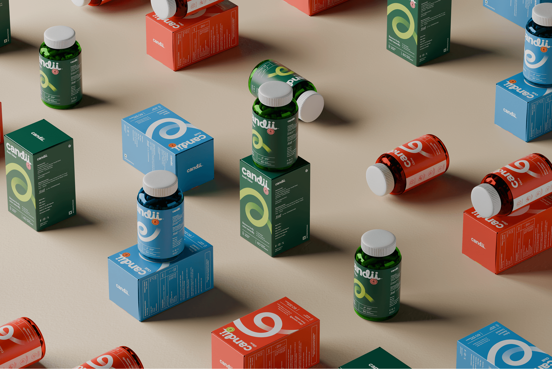
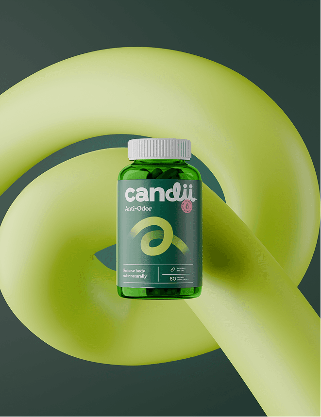
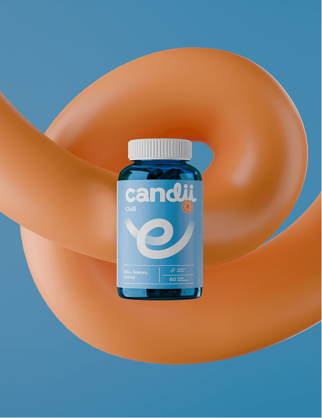
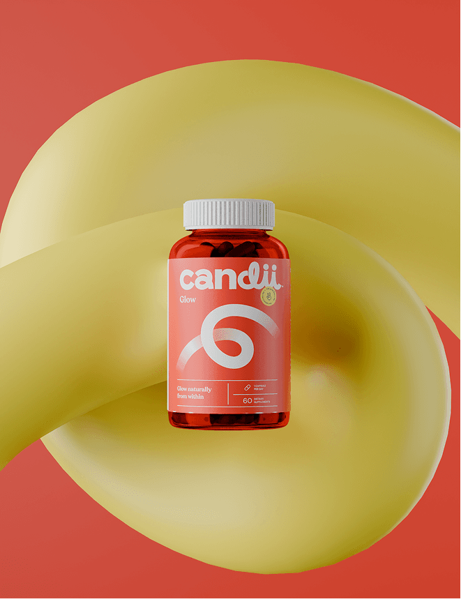
Packaging — Turning capsules into joyful daily rituals

Candii’s packaging is designed to stand out — on shelves and online.
Bold color, expressive typography, and the signature Candii Swirls make each product instantly recognizable.
Each SKU uses a looping letterform that references the product name —
for example, an “A” swirl for the Anti-Odor variant — bringing expressive type and brand elements together in a playful yet structured way.
The first three products are:
- Candii Anti-Odor
- Candii Glow
- Candii Chill
Clear communication, clean ingredient cues, and a bold visual presence make Candii feel premium, modern, and fun.


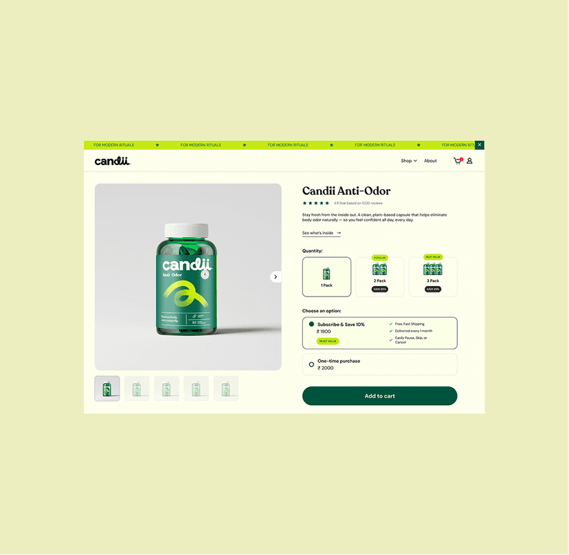
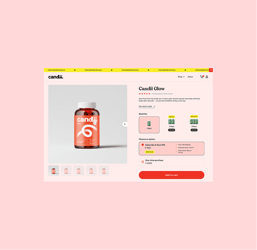
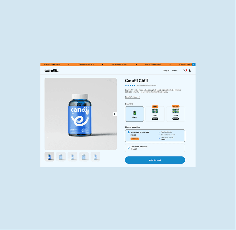
Web Experience — Crafting a shopping experience built to convert

We designed Candii’s digital presence from scratch, crafting an experience that clearly communicates the product story while guiding users toward confident purchase decisions.
The Shopify-built site highlights:
- Clean ingredient transparency
- Tangible benefits
- Lifestyle-driven photography
- User-generated imagery
We integrated Subscribe & Save to promote retention and recurring revenue, while volume-based upsells help increase AOV.
The PDP emphasizes clarity — distilling ingredients, benefits, and usage into simple, friendly language.
The overall experience blends education, storytelling, and seamless purchase flow.